
4. Future Consideration
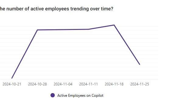
Copilot Insights > Overview - How is the number of active employees trending over time
Hello,
The graph for Copilot Insights > Overview - How is the number of active employees trending over time, ends up looking like there is a huge drop in active users because you present a graph for a week you don’t have all the data for - this is a difficult discussion with execs everytime we need to explain this - you could help us by only showing the graph for the data you have - so we dont have to explain oursevles all the time and there is no alarm when looking at the graph - this is the default view when we log into Analytics dashboard.